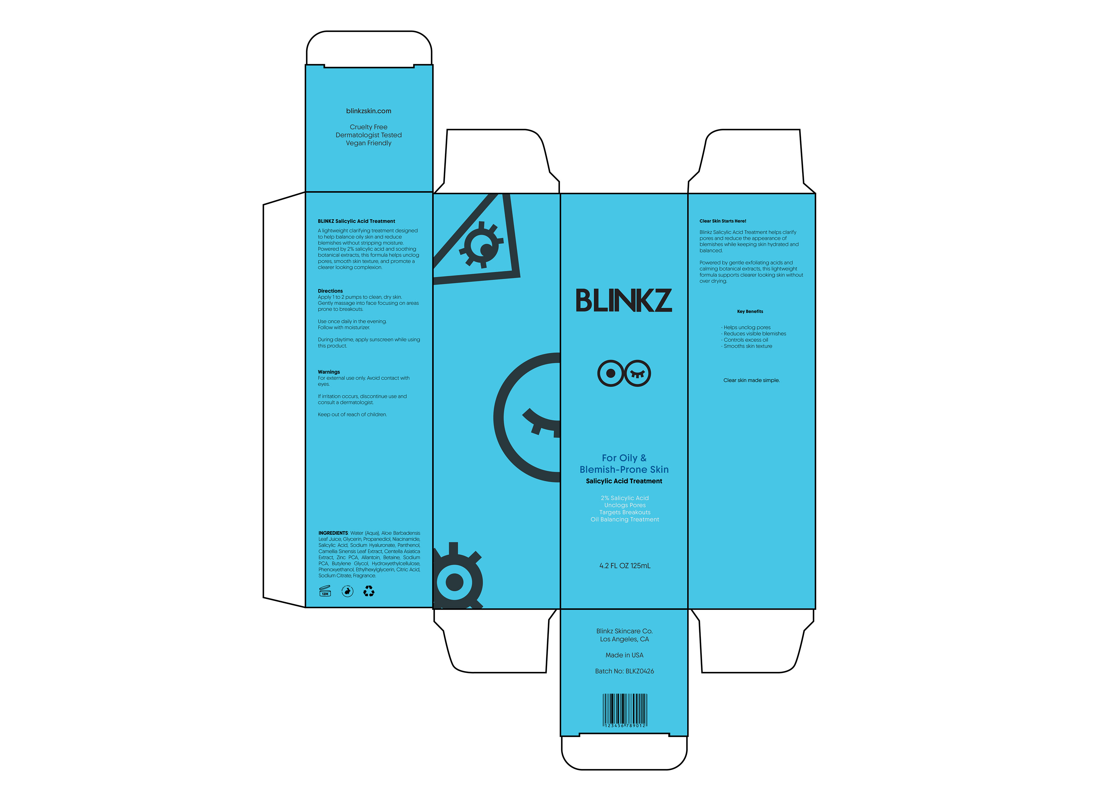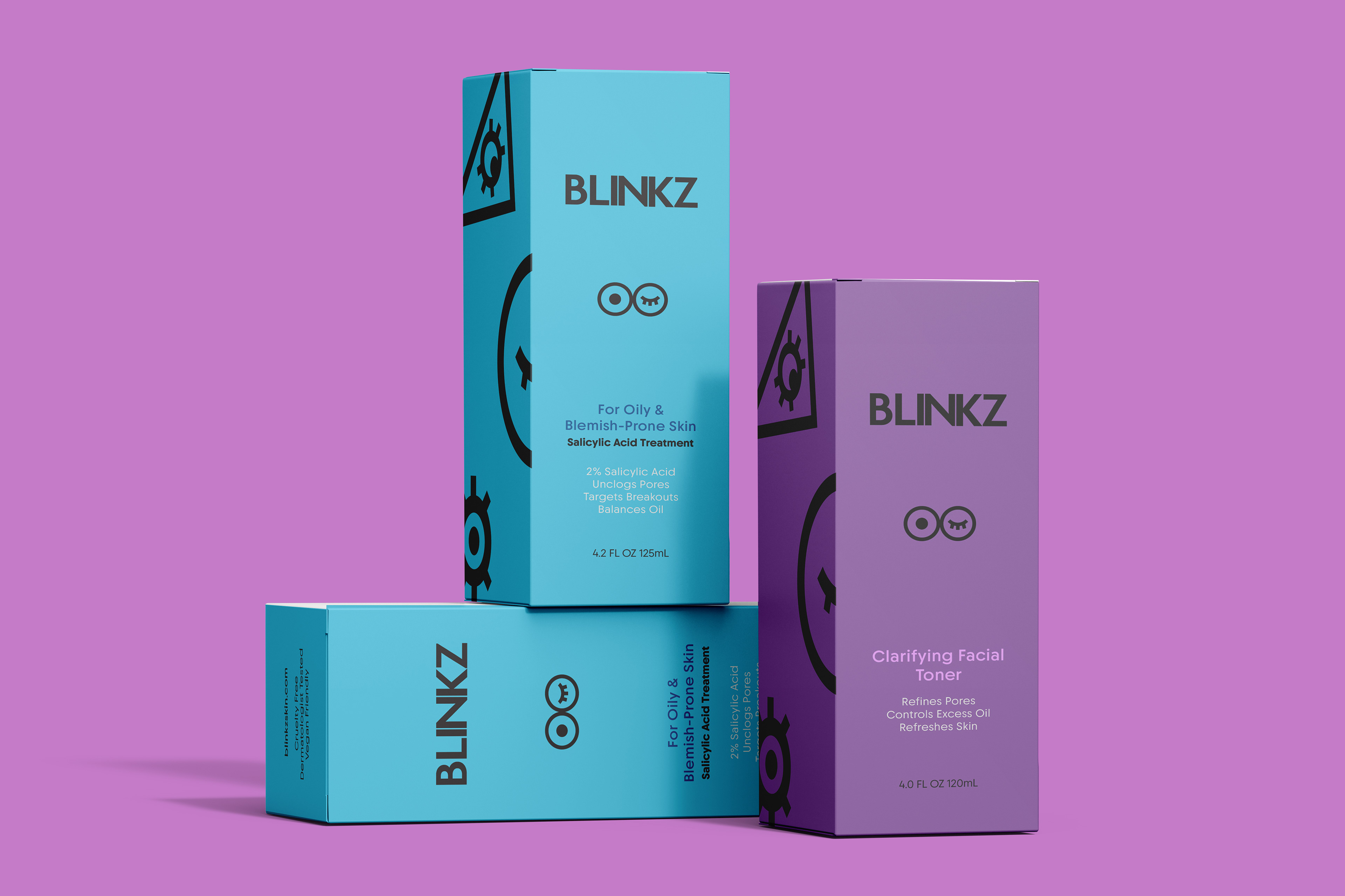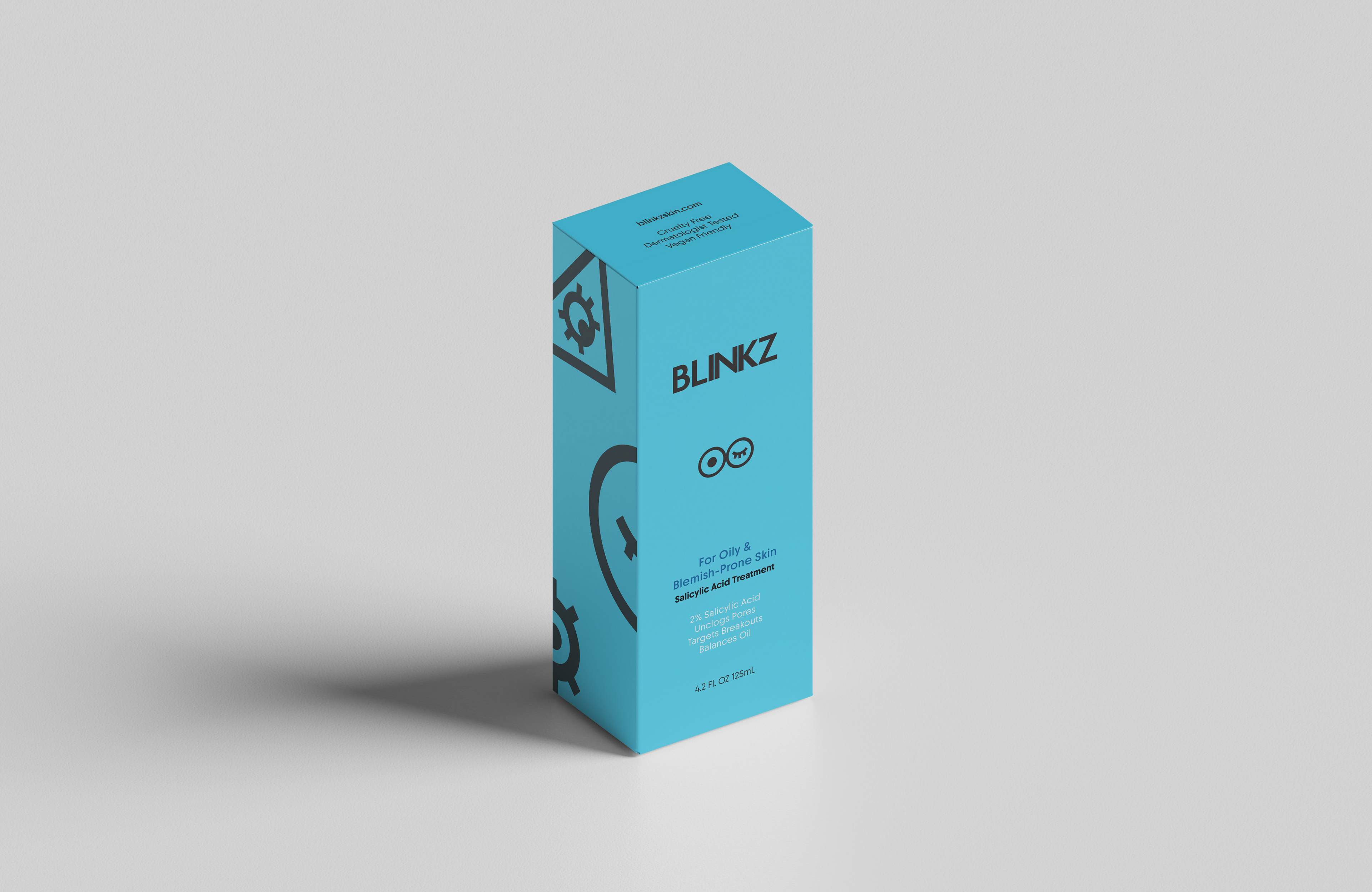
Blinkz is a skincare brand designed for Gen Z consumers, combining bold colors and playful iconography to represent daily skincare routines.
The name Blinkz was inspired by the act of blinking, connecting the brand to eye inspired visuals and the idea of quick, effortless skincare routines for everyday life.
A bold and minimal logo designed to reflect Blinkz’s playful, youthful energy and modern skincare aesthetic.
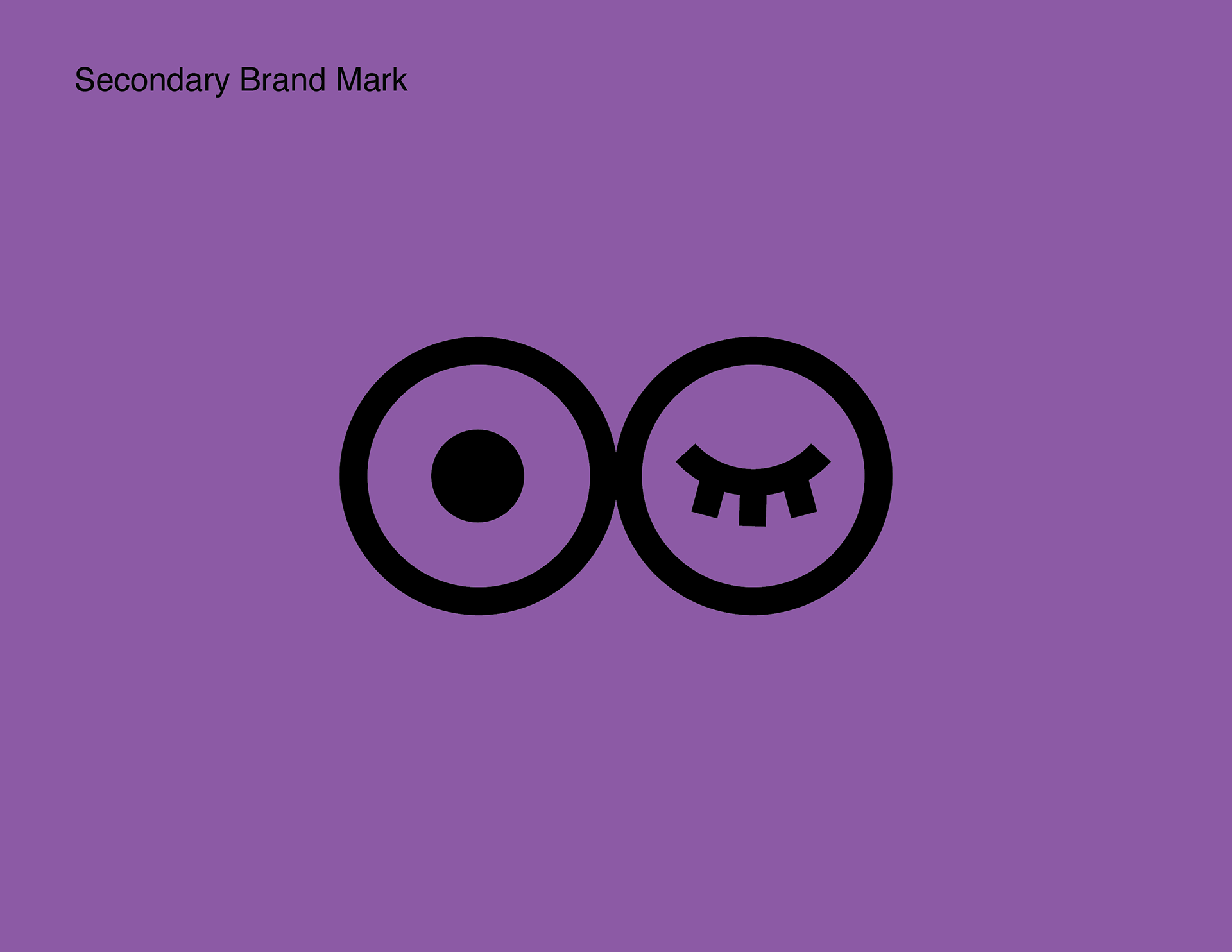
A secondary symbol inspired by astrology and daily skincare rituals, where the open eye represents the sun and morning routines while the closed eye reflects nighttime self care.
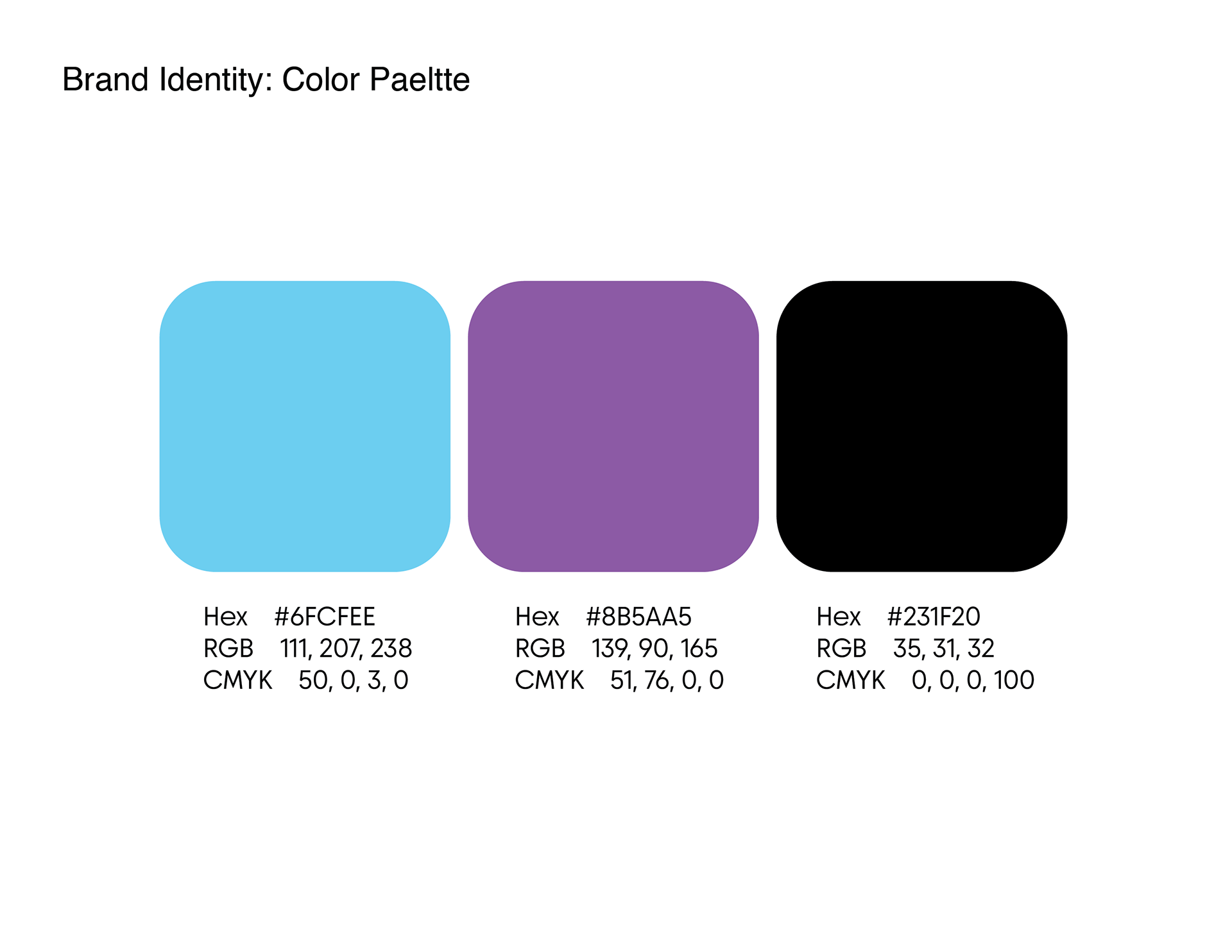
The color palette combines calming and expressive tones to reflect the brand’s personality. Light blue represents freshness and clarity, purple introduces a sense of self care and wellness, while black adds contrast and boldness to the overall identity.

Custom icon set designed to represent skincare routines and product functions.